

Ashley Montana Photography - Brand Identity
- Jan 8
- 3 min read

Quick peek into some of the details ↓
Services
Brand Identity - Logos, illustrations, patterns, typeface recommendations, branding mood board, branding guidelines
Industry & Client
Ashley Montana Photography recently went full time with her photography business, which should not be a shock to anyone! Her photography style is candid with incredibly composition and technique. She documents both lifestyle sessions and weddings/elopements!
Designer Note
This was our first organic client!! EKKK! Came into our inbox within the first week of our launch of Resqueue, which had us kicking our feet and screaming! But to make it even better, she's based out of Texas. This is far stone throw away from Huntsville, Alabama where we're based. Although design can clearly be done for clients wherever, we were truly expecting only Alabama clients while we got the ball rolling. So, Ashley had us shook!
Final Branding
Want to skip the details of how we got to her final brand identity?
No problem - Click Here!
Kick Off for Brand Identity!
About our Client!
When we launched Resqueue, we opened up a giveaway for full branding. Ashley told us that she originally signed up for that giveaway. When she didn't win it, she immediately inquired! Her gut was telling her that Resqueue was who she needed to trust with the rebrand of her business. Although she loved working for an event planning business, she could feel the jump to go full time right around the corner.
When going through her inspiration and business model, Ashley explained to us that she loved to photograph just about any type of session in any type of dynamic. However, she felt super called to weddings specially... especially destination elopements!
Big Takeaways
Her design inspiration was pretty split 50/50 between two polar opposite aesthetics. One was elegant, script-y (although she told us she hated scripted fonts.... even though her Pinterest board was riddled with them), and moody while the other was bright, punchy, and bold. You'll see that reflected in her directional boards!
Directional Drafts!
Directional Draft A
BOLD AND FUN is the middle name of this directional board! We wanted to be different (but still trendy) with the bold red color tones and cherry emphasis. To add to the uniqueness (because lets be honest, we don't see this branding often enough amongst the photography industry) by adding squiggly lines and elements.

Directional Draft B
The polar opposite design with the calmer color palette with an accent of gold. The stamp icon was a copy and paste from her inspo board, so we warned her that we would hand design her a stamp in her final design if she wanted to keep that element. When it comes to her business goals, this one felt the most aligned.

As you'll see here in a moment, the second directional board was the driving design for her final brand. We incorporated aspects of the first board, but we sadly had to say goodbye to the bold reds and bubbly branding. Between the time we sent the directional boards and the time we met to discuss which direction to go, Ashley's heart kept ping-ponging back and forth on which board she loved more. She actually had a branding photoshoot herself booked in this middle period, and she decided at one point that the first board was the route she wanted to go. So ironically, her branding photoshoot was editorial and busting with red colors.
Final Brand Identity
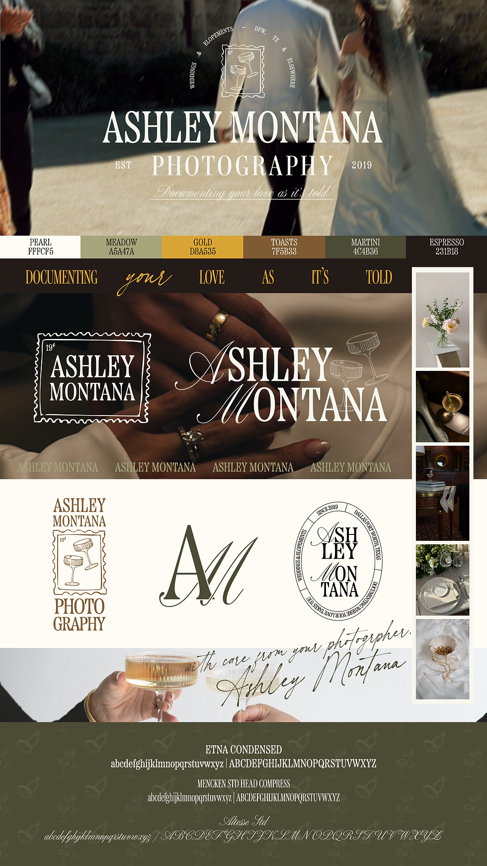
Detailed Primary Logo
The detailed primary logo in "Martini" which is a dark green color.

Secondary Logo
The primary logo in "Meadow". The glasses were hand drawn, scanned in, the touched up before we added it to her branding package.

Stacked Logo
The secondary logo in "Gold". This is a slighly different feel from her Primary and Secondary logo to provide a more playful element that also showcased her love for traveling. The 19 cent is perfect since she started her business in 2019.

Submark Logo
Submark in color "Toasts". This was the only design element that was brought over from her first directional board.

Detailed Submarks
Detailed Submarks in color "Espresso". She received to detailed submark because we haaaaaaaad to give them to her. The first one represented below is nontraditional with it's length, so we designed a second one.


Final Takeaways!
After her branding was complete, Ashley was so incredibly impressed by the whole process that she vowed to us that she would come back when it was time for a site upgrade! Needless to say, we cannot wait!
Done being frustrated when it comes to curating your own brand identity? Outsourcing your logo designs might be the best thing to provide a new level of professionalism and personality to your business! Get out of your own way, and let us do all the heavy lifting!


Comments