

Lauren Makenna - Brand Identity & Site Design
- Jan 8
- 4 min read

Quick peek into some of the details ↓
Services
Brand Identity & Site Design - Logos, illustrations, patterns, typeface recommendations, branding mood board, branding guidelines, a site that includes both mobile and desktop designs.
Industry & Client
Lauren Makenna Photography is bright and airy photographer based out of Huntsville, Alabama. Although she has claimed North Alabama home, her business has taken her all over the place globally! Her knowledge, experience, and professionally has landed her several high quality and budget clients over the last 5+ years. It was time for her branding to reflect so!
Designer Note
Lauren has been one of our favorite clients to design for! Lauren came to our first meeting with previous design elements, colors, and fonts that she wanted to include in her brand refresh. However after the first round of directional drafts, she felt that it was time to fully ditch her old branding and move on with something new!
Final Branding
Want to skip the details of how we got to her final brand identity?
No problem - Click Here!
Kick Off for Brand Identity!
About our Client!
One astounding quality about our client Lauren is how well versed and business savvy she is. She is insanely ambitious and driven, which has resulted in her juggling several business. Although wedding photography is definitely a stream of income, it would fall more in the category of a creative escape from her real estate business and custom build home construction company. Just to drop your jaw a little more, she's also a mom, wife, and pet parent while being a flight distance away from family.
Lauren's previous branding was simple and clean, which was fitting for the aesthetic of her business. It, however, was missing that professional designer touch. No shame to those that use Canva to create their logo, but there's always a huge difference when a brand designer curates a custom look and feel for your business.
Lauren Makenna Photography is wildly successful with booking dozens of weddings a year both local to Alabama, in the region, throughout the country, and across the world. If you're looking for a clean, technique driven, bright, proper photography for your wedding day, Lauren is easily your girl!
Big Takeaways
When going through Lauren's design inspiration, she typically gravitated to the powder baby blue and soft cream colors (I know you know the exact color theme I'm describing). Veils, wedding cakes, table cloths and cloth napkins, pastel flower petals were the focal point for our design direction.
Directional Drafts!
Directional Draft A
When working through direction drafts, we design our branding elements between 50-70%. It doesn't make a ton of sense for us to design all the fine details for a log that will get ditched by the end of the week. Our next meeting with our clients after emailing over the directional drafts is always in person or over video chat so that we can thoroughly describe the direction that might not be evident.
Anyways, back to Lauren's directional drafts! With draft A, we included the fonts that Lauren brought with her to our first meeting along with that specific background seen with the primary logo below. We kept the color palette simple and sweet with a touch of yellow to mix things up.

Directional Draft B
In directional B, we shook things up a tad by adding more darker aesthetics, mix typefaces in the logos, and tones of green.

The final brand ended up being a perfect mix of both directional boards! During our second design meeting, Lauren was ready to ditch the Bondi 72 font that she has used from the beginning. We designed the first board to match where Lauren was at design wise. While the second board represented what we envisioned for her branding. The final result is *chef's kiss*!
Final Brand Identity

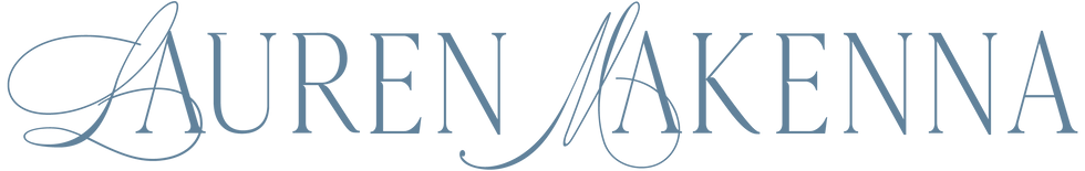
Detailed Primary Logo
The detailed primary logo in "Hydrangea".

Primary Logo
The primary logo in "Black Olive" which is the darkest color!

Secondary Logo
The secondary logo in "Hydrangea" which is stripped down version of the primary logo. We love this because she can add this to the bottom of emails or notes as a signature.
Stacked Logo
Submark in color "Teddy Bear". This color was not represented in either one of her directional boards. We added it later during one of our design meetings... and we're obsessed!

Submark
The submark is the color "Powder Blue". She received this with all the detail along with a stripped down version without the outer rim design.

Now let's talk Site Design!
We're actually almost done with her site as we speak!! So, come back at the end of January to see her in all her glory!
Final Takeaways!
All-in-all, we're over the moon with how Lauren's branding and site design turned out. The subtle connection of the fonts throughout her logo such as how the "L" and "M" connect into the "A"s in her name and how the "L" and "M" interact in her submark. It feels dainty and detailed! When looking at her logo suite, you can basically predict exactly what her photography style would be.
After two bright and bubbly brands from our most recent clients (Pretty N Polished and Riot Haus), it was refreshing to know that we still got it in the fine line, detailed, scripty space! We typically see this style the most often by our photography clients, so we're more than happy to keep exercising that design muscle.
Done being frustrated when it comes to curating your own brand identity? Outsourcing your logo designs might be the best thing to provide a new level of professionalism and personality to your business! Get out of your own way, and let us do all the heavy lifting!


Comments