

Larsen Zehr Photography - Brand Identity, Material Designs, Photoshoot, and Site Design
- Dec 17, 2025
- 5 min read

Quick peek into some of the details ↓
Services
Brand Identity, Material Design, Photoshoot, and Site Design (Big Rebrand Extra Package) - Logos, illustrations, patterns, typeface recommendations, branding mood board, branding guidelines, and 3 custom material designs, 1.5 hour photoshoot, and custom site design
Industry & Client
Our client wanted a maximalist design to show off their big personality while also being clear. Our client is wedding photography professional in North Alabama, but loves to travel globally for elopements. Although she loves shooting lifestyle sessions for previous wedding clients, she wanted to spend her energy marketing towards potential wedding and branding clients.
Designer Note
Since this was our first client doing the big three - branding, photoshoot, and site. We decided to approach it in that order. We didn't sit down to coordinate all the details for her photoshoot until we had her final branding. That way we could include colors and textures that complimented her logos and future site design... Best decision!
Final Branding
Want to skip the details of how we got to her final brand identity?
No problem - Click Here!
Kick Off for Brand Identity!
About our Client!
Larsen is a fun loving, tik-toking, outgoing, doesn't know a stranger photographer based out of North Alabama. Documenting and sharing love stories is her middle name, but providing a relationship and environment for her clients to be comfortable is her first name.
If you know Larsen, you'd know that she embodies the statement "go big or go home!" She puts her heart and soul into what she does and the experience she provides her couples. Therefore, she needed a brand and site that was so clearly hers.
When she reached out, she made it clear she wanted a maximalist design that was also organized... organized chaos if you will. Let's check out what we came up with!
Big Takeaways
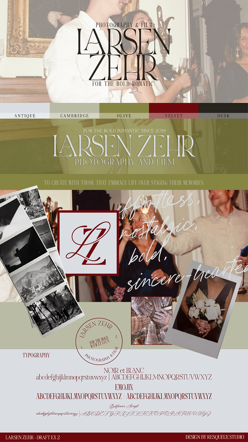
From her branding inspiration, she was drawn towards some rowdy colors - deep purples, reds, unnatural greens, and such. She wanted her logo to have some connectivity with characters or other elements. She also was a big fan of hand-written elements.
Directional Drafts!
Directional Draft A
This first directional board leaned more into the warm natural tones that felt both romantic and bold. The length of the text almost gives a thin, gothic feel, which is a tad different than a bold typeface you might expect with a more maximalist approach. We plan to include that cluttered look with overlapping elements, such as striped patterns, handwritten text, and old-school photography mediums.

Directional Draft B
This board was meant to make you feel a bit uncomfortable, but in a cool camp type of way (we used that word correctly, I think... I'm getting old). Since Larsen was so drawn towards the deep red tones, we decided to throw that into this board as well. However, we really focused on yellow-green color tones. The font was thicker and more jumbled. We also went all out maximalist with the fonts, photographs, and logos. The choas was less organized with this one.
When we met, it was clear that Larsen was really feeling the direction of the first draft. The logos weren't exactly where she wanted them, but the font and color scheme was almost perfect. The handwritten font, submark, and the yellow-green on the second board were hearted as well.
Final Brand Identity

Primary Logo
The primary logo in "Velvet" which is the darkest color!

Secondary Logo
The secondary is just a stripped down version of the primary logo. Here it is in color "Olive".

Stacked Logo
Stacked logo in color "Dior".

Submark Logo
Submark in color "Pinot"! The border to this submark is meant to resemble an antique mirror. After the initial drafts, Larsen shared with me that she envisioned her submark being a cursive L and Z that connected into a heart (which shows up a lot in her hand-written signature).

Stamp Logo
Stamp logo in color "Pinot" and "Velvet". The inspiration for this logo was a wax seal.

Photoshoot
After designing her branding, we jumped into planning her branding photoshoot. We searched for the perfect studio that represented rustic and realistic textures while also being moody and bold. I stumbled upon Sterna Studios in Chattanooga, and immediately knew we would be making a road trip for these photos.
Larsen did some searching on her end to find a wardrobe that matched her new color palette. She found the perfect jumper from Target and green striped dress.
Her photoshoot included black and white film, digital photos, high resolution videos, and camcorder footage. We really go all out for our branding shoots!
Site Design
With her site, we needed to continue forward with the organized chaos. Larsenzehrphotography.com is full of overlapping elements, patterned backgrounds, type writing font, nostalgic elements, and loud personality.
Her site structure includes a home page, branding session page, wedding portfolio page, intimate wedding portfolio page, wedding investment page, inquiry page, and blog. She's a loaded site - that's for sure!
Material Designs
As part of her package, we included 3 marketing material designs. With marketing materials, we are just the designers. Our package does not include ordering or the material costs for your designs. We do, however, share where you should order them! If you decide to go with a different printing vendor, it's important that you throw us into the loop. Different vendors have different sizing requirements or templates. Let us make those adjustment for you so that your designs come out exactly as expected.
Post Card


Packaging Tape

Business Cards
These will be die-cut, which result in her cards being the shape of her submark.

A

Final Takeaways
Larsen has been a dear friend of ours for a while. We're seriously teary-eyed over here that she trusted in us to give her baby a facelift. Our girl was over the moon with the final result!
With her site launch, we gave her a thorough run-through on how to make changes In her site designer (wix). Since her launch, she actually added another investment page that she can share with her clients that interested in booking her for their elopement. Although it is a duplication of her wedding investment page with a few text changes, we're so excited that she felt comfortable and empowered to make site changes on her own (with a little bit of guidance from our side).
If you decide to make changes to your site a few months after we shared her with the world, we're more than happy to coach you through it! We don't just transfer your site, dust our hands off, and walk away. Believe it or not, we actually do little health checks on your site ever couple of months to make sure that everything look and works how it was intended.
Done being frustrated when it comes to curating your own brand identity? Outsourcing your logo designs might be the best thing to provide a new level of professionalism and personality to your business! Get out of your own way, and let us do all the heavy lifting!


Comments